Basics
The aim of a presentation is to make the audience more informed, but the problem is they are often listening to you with varying background knowledge. The best speakers make time to bring the audience up to speed, but do it quickly enough not to bore those who already know. This is particularly important in a technical talk.
Remember that depending on the length of your talk, you may not be able to tell everyone how much you've done. Whilst this is annoying, you need to focus on a particular thread of investigation you took and tell the audience a story about it.
Importantly, this means that the thrust of your talk may not reflect the title of your project. I like to skirt round this by having a sub-title that expresses the direction you will taking the audience in.
Rules
- Do not read off the slides
- DO NOT READ OFF THE SLIDES
- Use animation sparingly, and sound not at all
- Pictures are better than text
- Never have a slide on screen for less than a minute
- Link your slides visually, as well as verbally
- Tell a story
Design and Layout
PowerPoint comes with some default designs; if you have no imagination, please feel free to use them. For everyone else, this is one of the easiest ways to give the impression of knowing what you're talking about.
Colour
This is the most important thread that people can follow through your talk. For instance if you have interpreted seismic horizons in colour, always write them in that colour when you refer to them.
Setting up the colours is easy, simply go to Design > Colours > Create New Theme Colours. To get the colours exact, use a website to see the RGB values from one of your images and type them into PowerPoint. These should be colours from your company logo perhaps, or complementary to your final overview image.
Layout
In order to move past using default designs, you can set up your own. Once you open the Slide Master it should become clear how it works. If you set up logos and coloured boxes on the first slide they will be repeated on all the others (ie when you do Home > New Slide). This is also a good place to set up the font style and the colours.

The Slide Master sets up the layout. You'll find it in the View tab.
Here's my intro slide. It has the title, a subtitle, my name and the date, then any company logos. The borders focus the eye, and provides space for the page number.
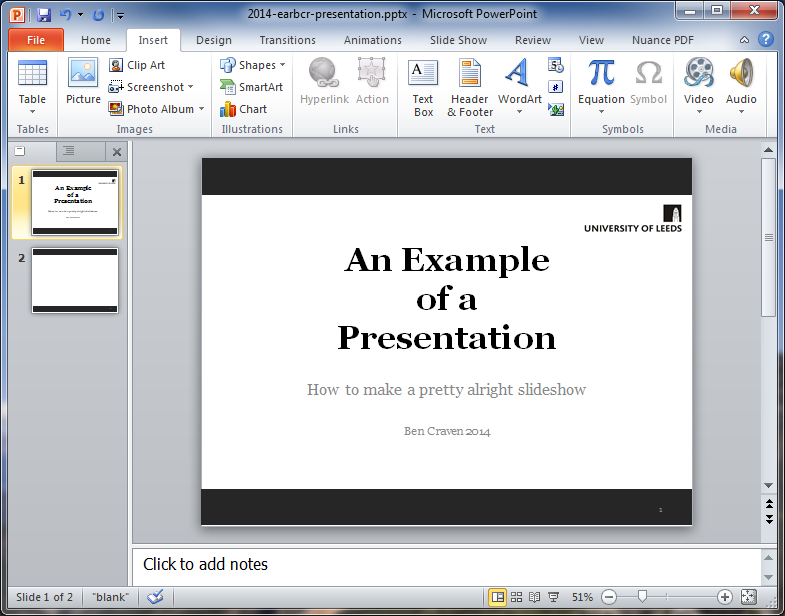
There are a few problems with this already: shouldn't the sub-title have consistent capitalisation? Does the title need to be on 3 lines? Does this page really need a slide number?
Images
The images are the most important part of the presentation. If you haven't got good images then you might as well not have a PowerPoint.
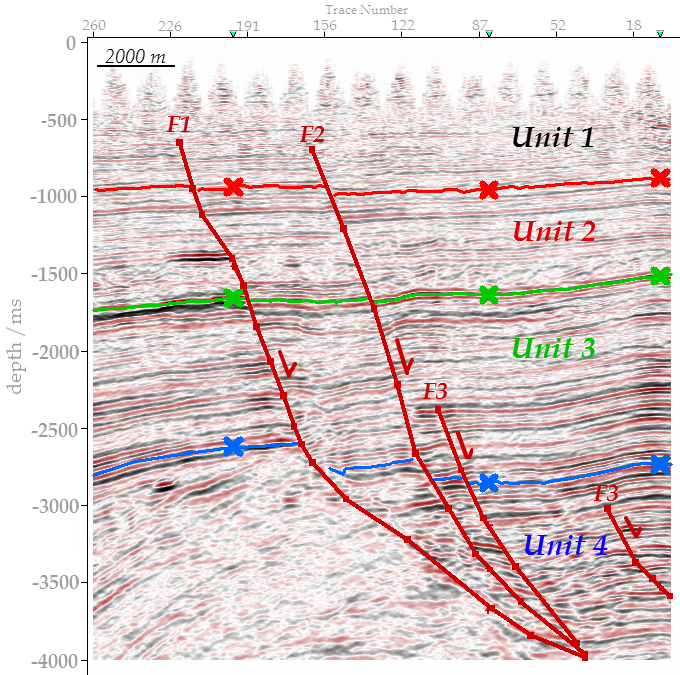
Your pictures need have the usual things: scales, orientations, legends, but they also need to be extremely streamlined. Any superfluous information is going to distract your audience from what you're saying. By all means have annotations that you don't cover directly (and you probably shouldn't be reading them out anyway) but make sure that everything is there for a purpose.
The picture below is probably the sort of thing you'll be wanting to include in your presentation- an interpreted seismic section. I'll list the problems with putting it in as-is:
- Labels are far too small
- Nothing is annotated
- No location map to reference this line to the others
- No scale on the vertical axis
- Line number is repeated at every trace number- it's unnecessary
- The interpreted horizons aren't easy to see
- The faults are the same colour as horizons

A simple print-screen from Petrel 2013, pasted into Paint and then cropped.
A better (but not perfect) image is shown below. A simple, subtle animation such as this can really improve a presentation as it focuses the audiences attention to exactly what you want to show them.